PDF Viewer 2.4 for iOS
Posted in Product Updates on
by Stefan Kieleithner

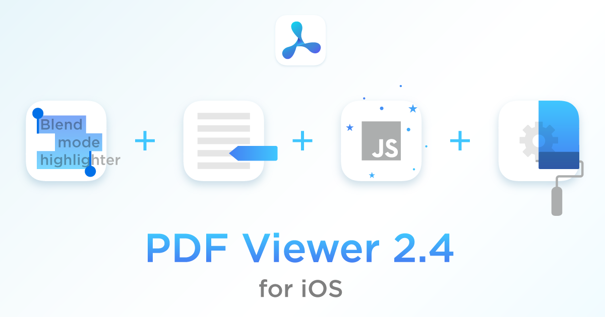
Blend Modes
Blend modes define how two layers are blended into one another. In PDF Viewer, the default blend mode simply overlays colors. So for example, when using the yellow ink highlighter, black text becomes a yellowish brown.
In the new version, the freehand highlighter tool uses multiply as the blend mode, just like highlight annotations do. This improves text legibility, and black text now stays black. For ink annotations, the blend mode can be changed directly in the annotation inspector.
Stamp Annotations
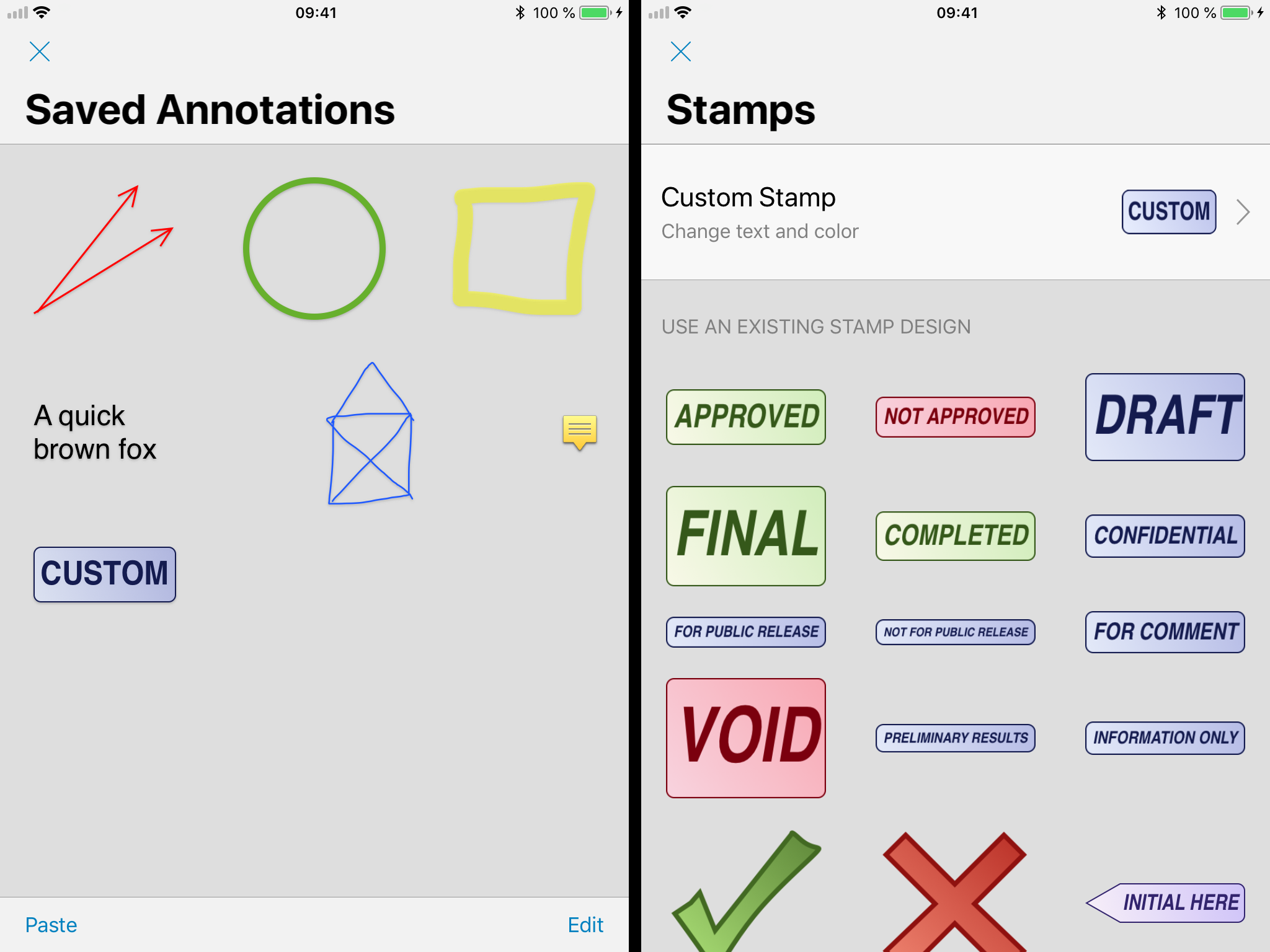
Many of you might not have even been aware that PDF Viewer ships with a saved annotations UI. This can be used to store frequently used custom annotations and apply them across documents. The feature, which previously hid in plain sight inside the stamp annotation UI, is now accessible via a separate annotation toolbar item, which makes it much easier to discover and access.
The stamp annotation picker user interface itself also received many small improvements in this update, including an improved stamp list layout and a more obvious custom stamp button. The improvements also extend to stamp rendering itself. Most notably, stamps now keep their aspect ratio even during resizing.

JavaScript Support
We’ve completely overhauled our JavaScript handling for form validation and document actions. You’ll notice that documents relying on JavaScript will execute these functionalities more accurately than before. This will improve compatibility with the vast majority of documents out there.
Redesigned Settings
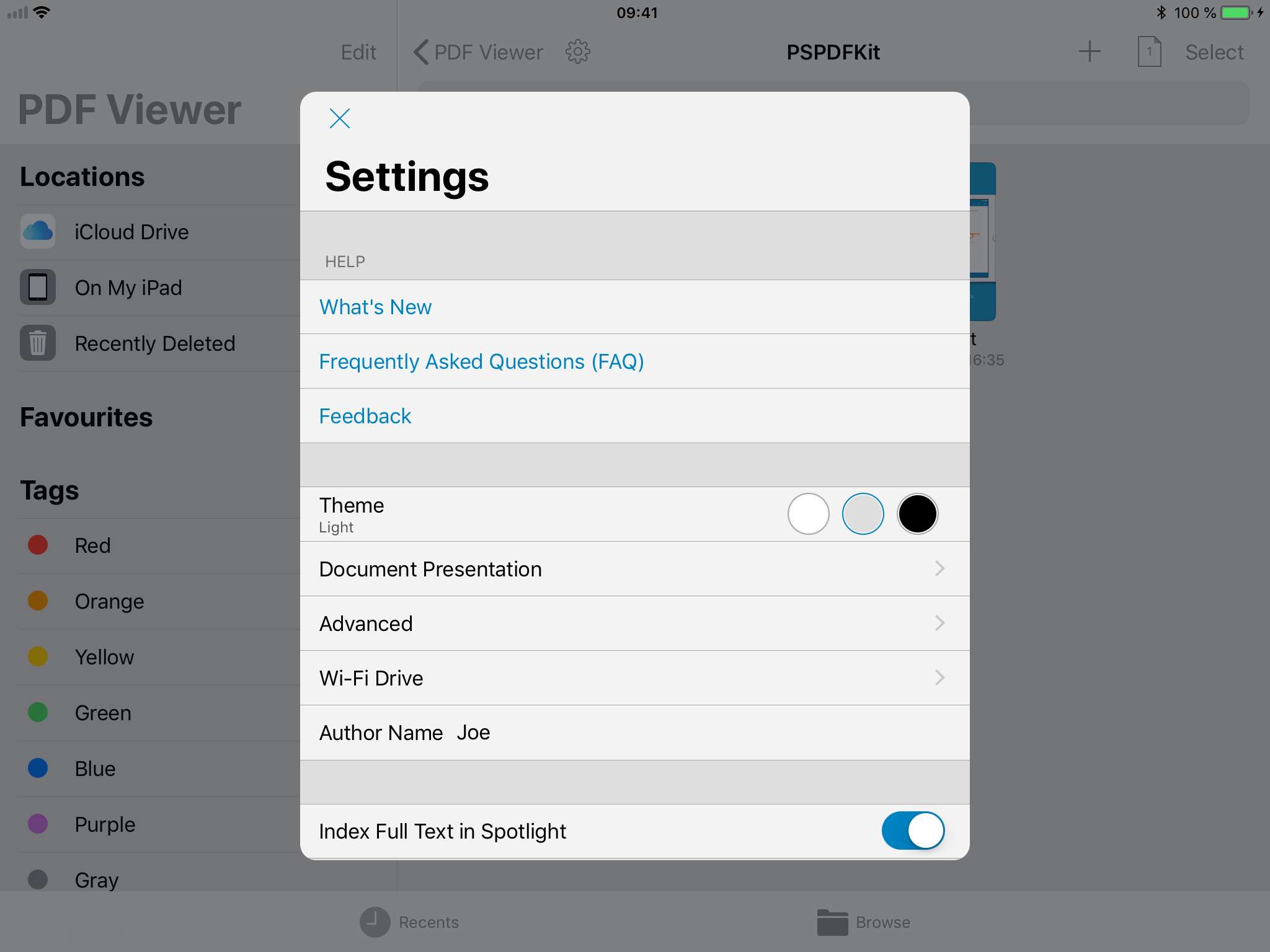
The settings screen was restructured to make navigating it a more streamlined experience, allowing you to find the options you’re looking for more easily than before.

Details
Along with the changes already mentioned, we also made many other smaller ones under the hood. These include allowing fast page switching by tapping the edge of the document and hiding the home indicator on iPhone X when the user interface is hidden. We also made various layout improvements, a lot of bug fixes, and much more.
